
Marketplace software · evidence review
JSitter: childcare marketplace interfaces
A childcare marketplace interface for date-based discovery and booking requests.
ContributionProduct-interface walkthrough; detailed delivery scope is not specified
View the product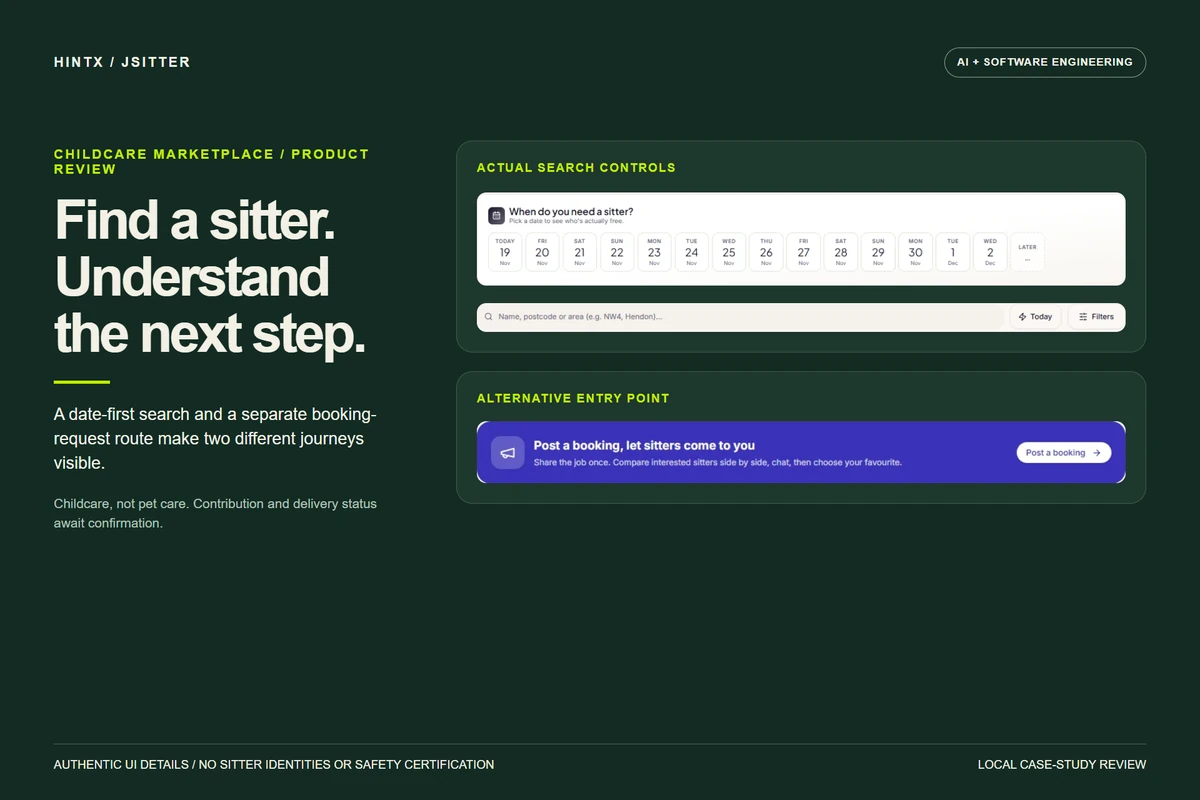
Finding a sitter is a sequence of decisions, not just a list of profiles.
A parent starts with a time and place, then needs a way to inspect options, communicate and understand the booking state. The supplied JSitter screens show a childcare marketplace with discovery, booking, messaging and administration surfaces. It is not a pet-care project.
Attribution boundary: This overview explains the evidenced product journey. It does not assert an unverified implementation stack, delivery state, safeguarding outcome or account total.
01 / Begin with when and where
The browse interface gives date selection and a location/search field a prominent place before profile inspection. Cropping to those controls removes private names, profile pictures and unsupported counts while preserving the actual product pixels.
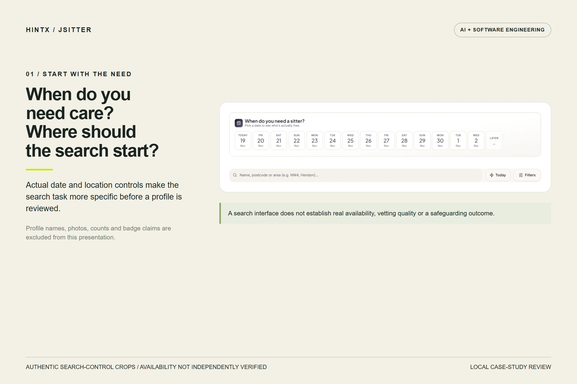
Authentic date and search-control crops. Personal profiles, account counts and verification badges are omitted; the interface alone does not establish current sitter availability or safeguarding checks. Select the image to enlarge.
02 / Support two ways to begin
The home screen offers both finding a sitter and posting a booking. Those entry points serve different user approaches: browse available options first, or describe a need and review interest. The illustrative journey makes that distinction readable without manufacturing a family, sitter or successful booking.
The supplied booking material includes awaiting and cancelled states. A clear state helps someone understand what still needs attention; these captures do not establish completed payment, ranking quality or a verified childcare outcome.
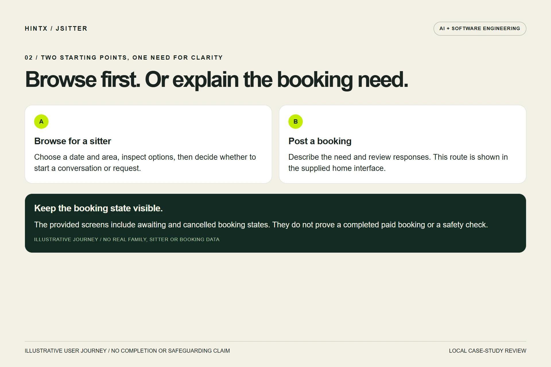
Illustrative browse-first and booking-first journeys based on visible product areas. No real family data, completed booking or safety certification is depicted. Select the image to enlarge.
03 / Make the operational side legible
The administration navigation includes users, bookings, withdrawals, referrals, review areas, messages and an audit log. The new composition uses the actual navigation strip and an explanatory grouping. It excludes the dashboard's unverified financial totals and private records.
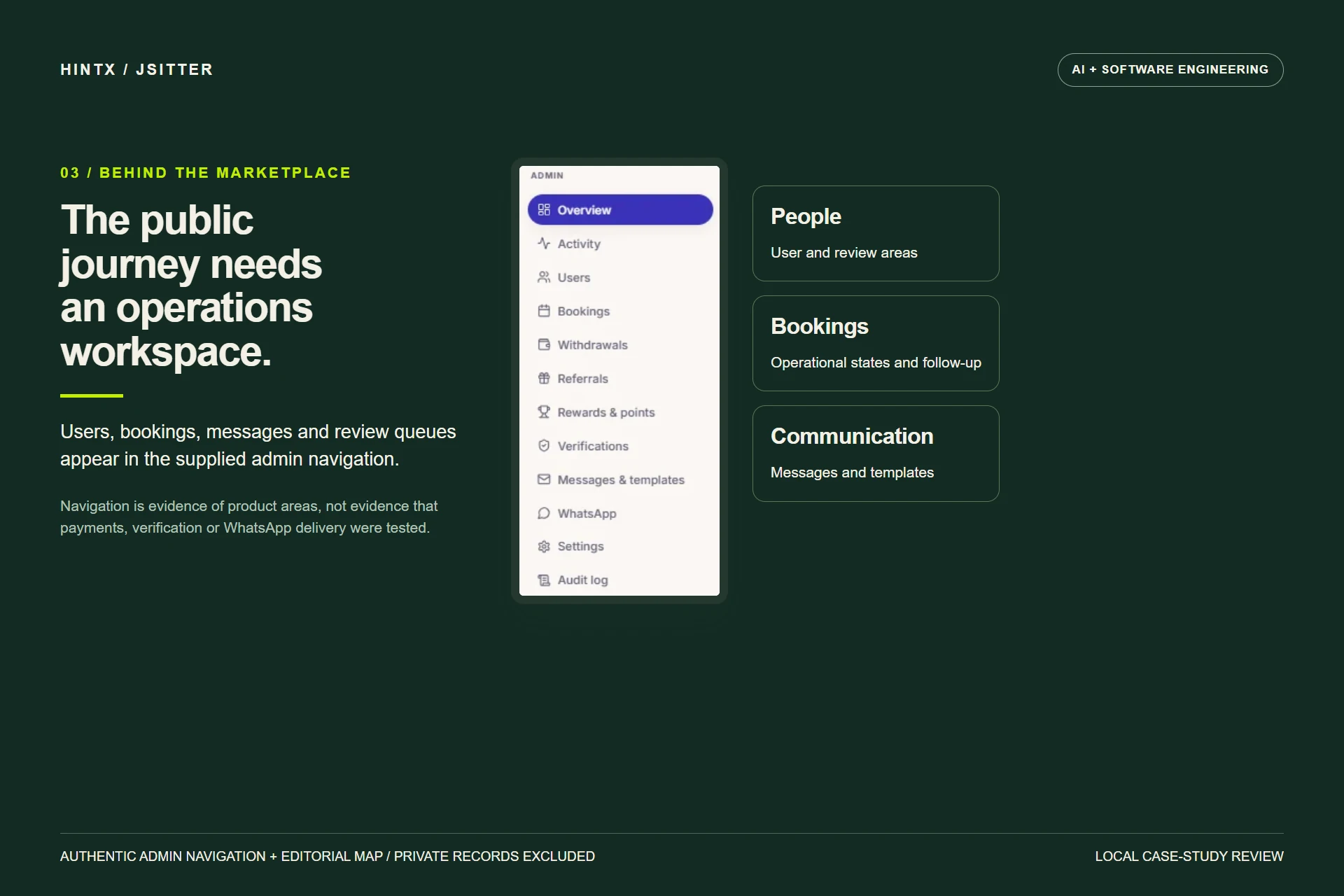
Authentic admin-navigation crop with an illustrative operations grouping. Navigation does not prove payment execution, vetting quality, WhatsApp delivery or backend implementation. Select the image to enlarge.
What comes next for the case study?
Confirm the engagement and delivered work, then obtain an approved booking walkthrough using clearly labelled test accounts. Payment, cancellation, verification and message-delivery evidence should be reviewed separately. No AI matching, revenue improvement, user growth or safeguarding guarantee has been added to fill gaps in the source material.
Explore a related engineering problem
Web application engineering · A separate booking and operations platform · Discuss your workflow with HINTX.
AI + software engineering
Make your systems work together.
Tell us about the workflow, the people using it and the constraints that matter.
Discuss your project